25+ Awesome mint green bullet journal themed spreads!
Updated in May 2019! Finding mint bullet journal spreads is actually quite hard! But we had a great mint week and found some absolute stunners!
Mint and turquoise spreads are probably the hardest ones for us to find! So having over 25+ gorgeous spreads is such a treat as it is totally mu favorite color!
Turquoise is a shade of blue that lies on the scale between blue and green. It has characteristics associated with both of these, such as the calmness of blue and the growth that is represented in green. Turquoise can also has the energy that yellow transmits, becoming an uplifting color. Let’s take a look at the associations turquoise has.
Serenity
Turquoise is similar to aquamarine and has a strong link to the color of the ocean. As such, it can be connected to calmness and peace.
Balance
Turquoise is a color that balances blue, green and yellow, but it also can be linked to emotional balance. Looking at this color gives a feeling of serenity and stability.
Like blue, it can be associated with clarity of mind and creativity.
Introspection
This is a color that encourages reflection and focusing on one’s own needs, thoughts and feelings.
It can be connected to a higher self-esteem and love for oneself. However, it can also be a color related to aloofness and being too self-centered, leading the person to shutting out other people.
Emotional Control
Turquoise is related to serenity, but it can also be related to a focus on the spiritual and the intellectual aspects of the person over emotions.
Turquoise doesn’t encourage emotional expression and can transmit neutrality. Too much of it leads to coldness or indifference. Emotional control is important, but a lack of emotion can be dangerous.
Positive and Negative Aspects of Turquoise
Turquoise is a lovely color with both positive and negative associations. It is linked to calmness, serenity and peace of mind, as well as to mental clarity.
Turquoise encourages creativity. It is a color linked to the ocean. It is also associated with balance and emotional stability. Turquoise has the characteristics of blue, green and yellow.
It can also be associated with introspection and emotional control. The negative aspects of turquoise are that it can lead to being self-centered and shutting out other people in favor of oneself. Another negative aspect is an excess of emotional control that can be perceived as indifference.
Lets talk about this weeks amazing choice of mint bullet journal layout ideas and spreads! This week we had such an amazing collection of accounts to feature. It was filled with amazing turquoise and mint spreads which were lush and pretty.
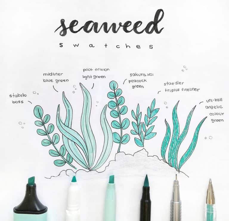
In our last posts about mint have covered off a variety of Mint inspired topics like – the psychology of the color mint and what it represents. This time I thought we could look at how the color is actually made physically – and more specifically how the color mint is made in watercolor, because its fun to learn things right?
How the color mint is made
Green is a secondary color, which means that it is the offspring of two primary colors. In this case, yellow and blue.
So to make green, all you have to do is this: combine yellow and blue paint. It’s really that easy. Once you’ve played around with the ratios of color a bit (i found 70% blue and 30% yellow makes the best for mint), you can do something exciting: add white paint to the mix.
According to Windsor and Newton:
This is a colour that makes you think about mood as well as location. Turquoise creates thoughts of warm landscapes but cool tropical waters. It is, in many ways, a colour of escape and tranquility.
The name comes from the semi-precious stone which was imported by Europeans through Turkey from it’s origin in Persia, now Iran, and the word ‘turquoise’ itself comes from the French for Turkish. The stone’s colour combines the serene qualities of blue and the invigorating feel of green.
As a result turquoise is often used as an adjective to describe blues or greens and not as a hue with its own identity. However, this is a colour on a palette that does indeed have a lot to say about itself. Most people respond to it positively. It evokes thoughts of soothing, calming waters in a far off land and a relaxing escape from everyday troubles.
It can restore our sense of wellbeing or, as a stone, even make us feel protected from evil spirits.
Some cute accessories for mint bullet journal layout ideas
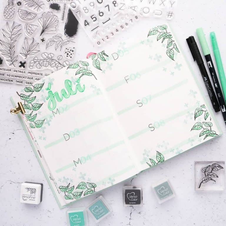
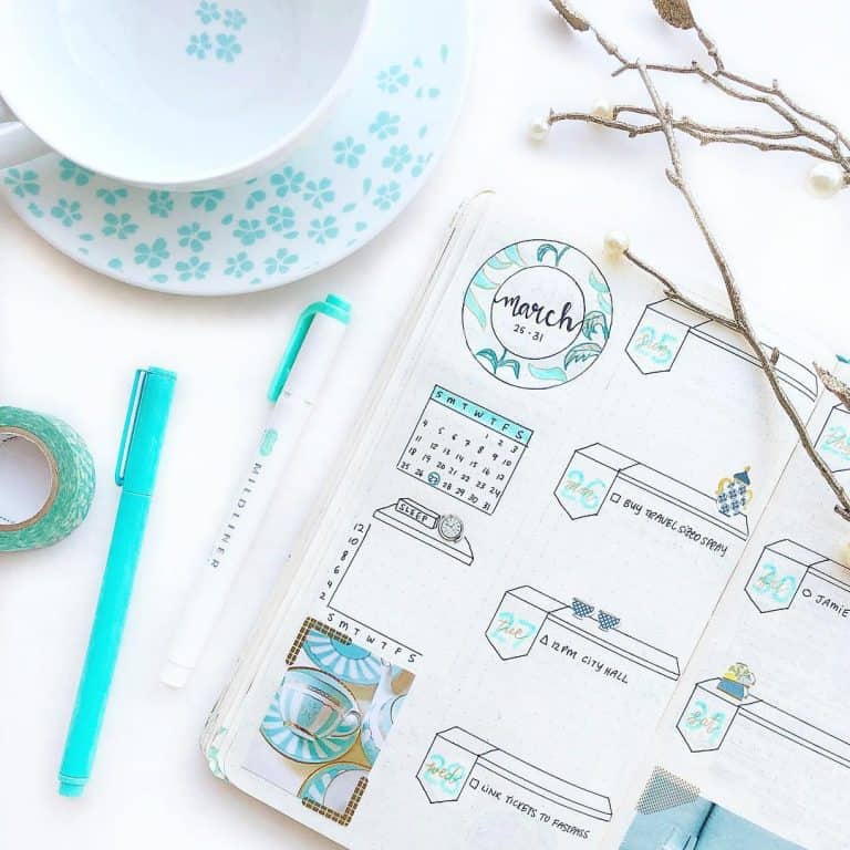
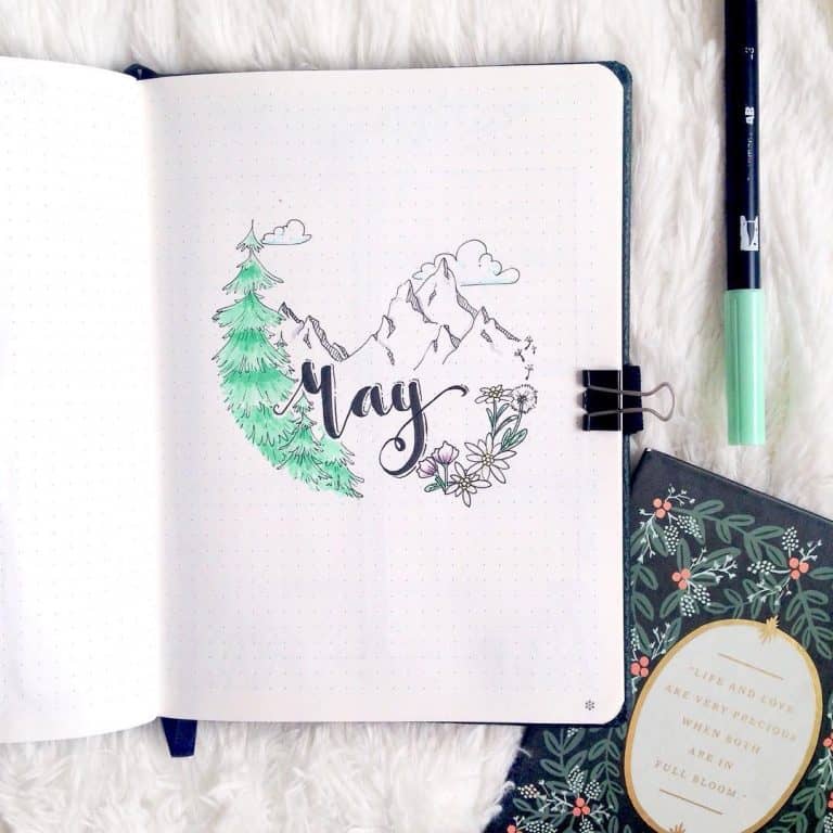
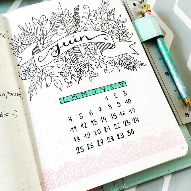
Awesome Mint green bullet journal themed Spreads:
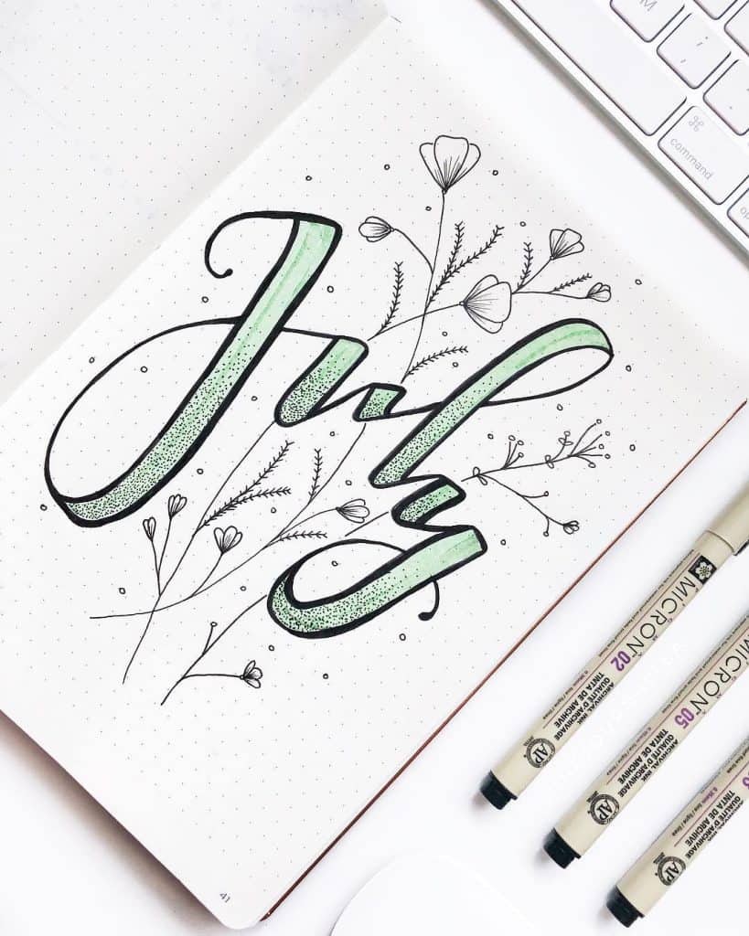
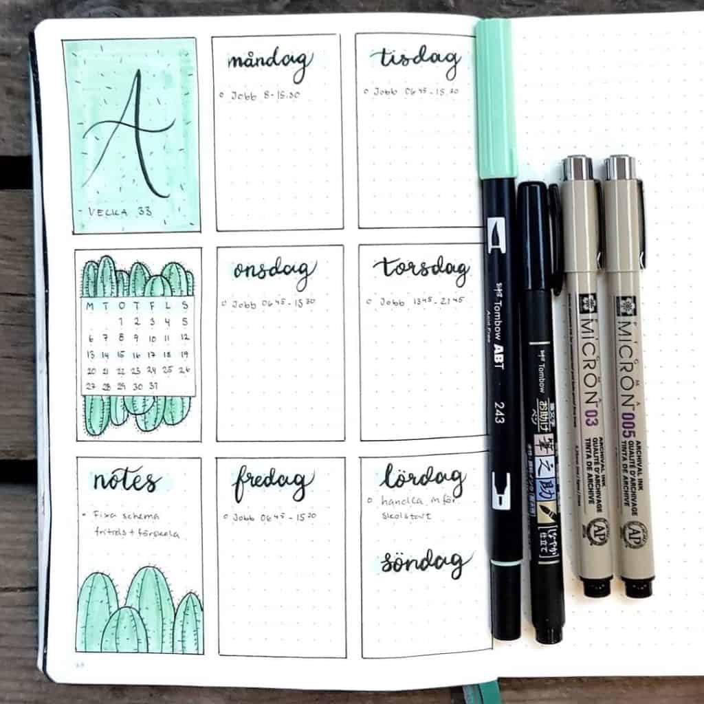
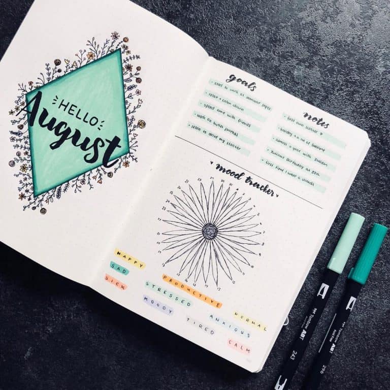
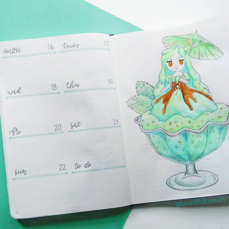
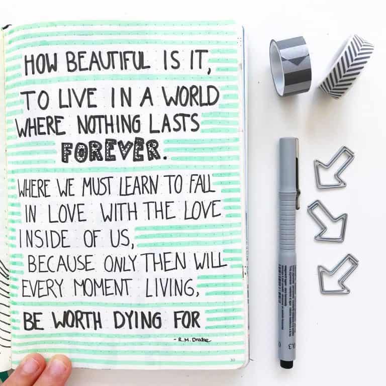
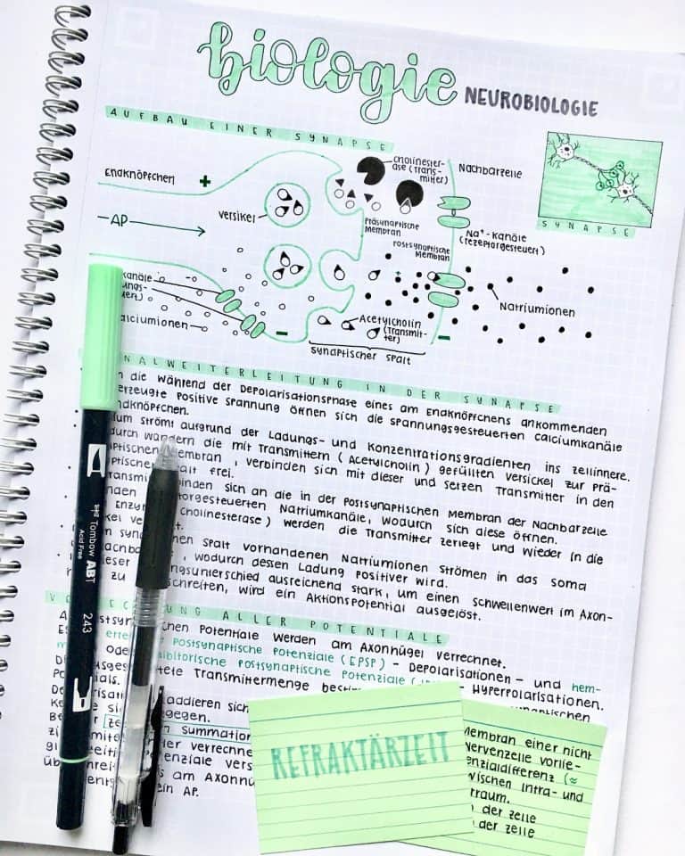
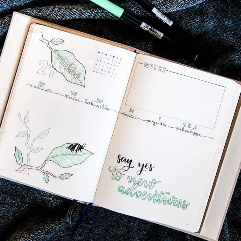
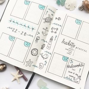
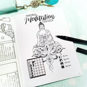
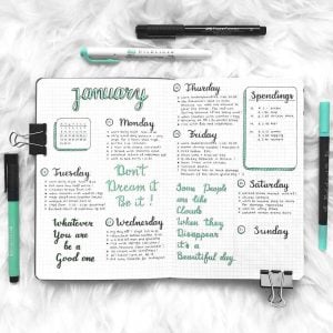
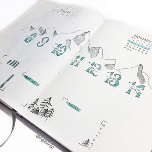
So lets get get straight into the top 10 Mint Journal inspirations from this week! WHOOT! Seriously though this week has been incredibly inspirational! Mint is my fave color! It was hard pulling together a top 10 because they were all so amazing!

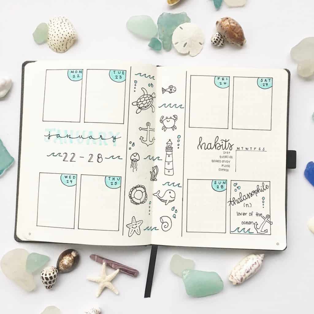
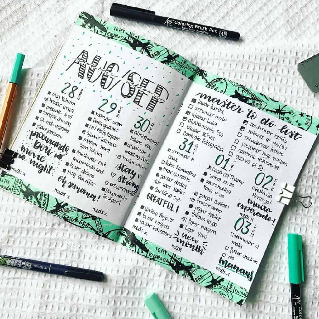
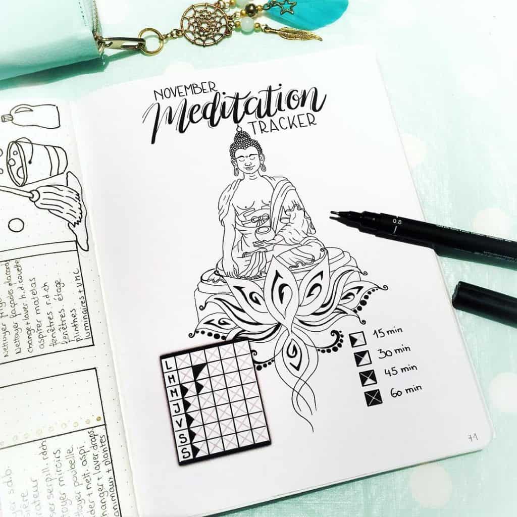
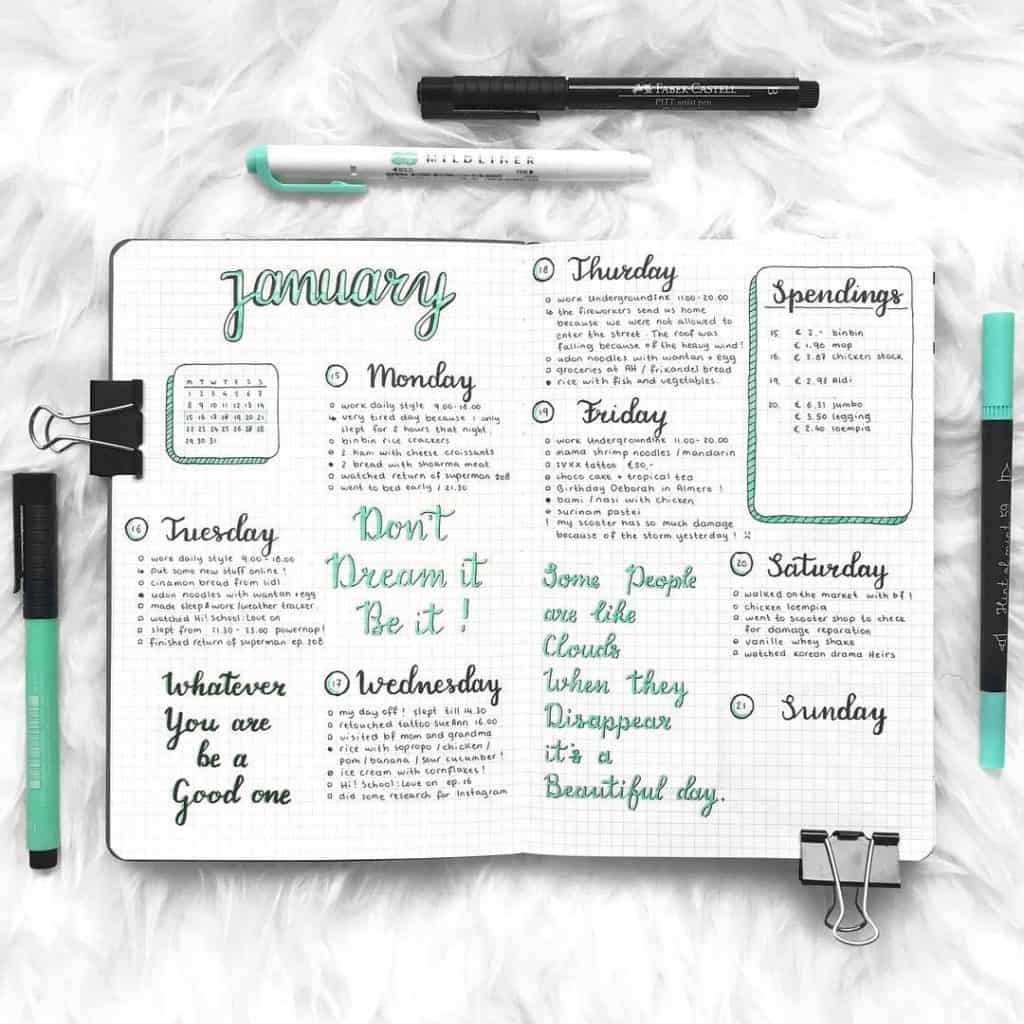
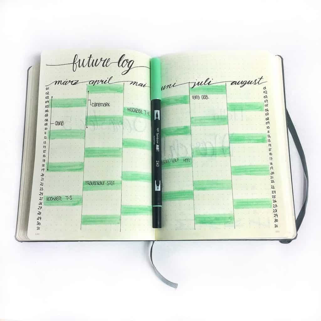
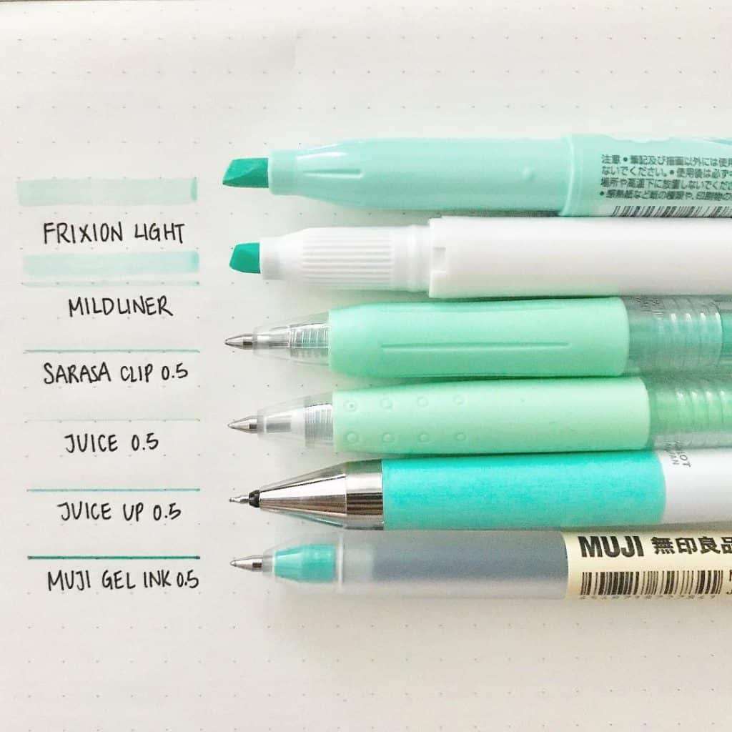
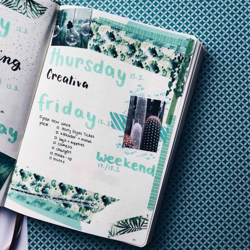
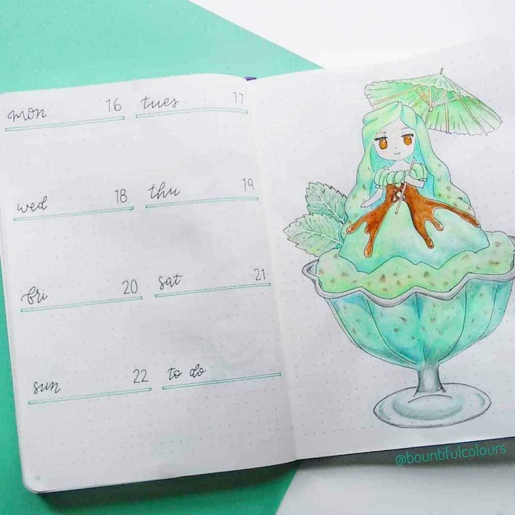
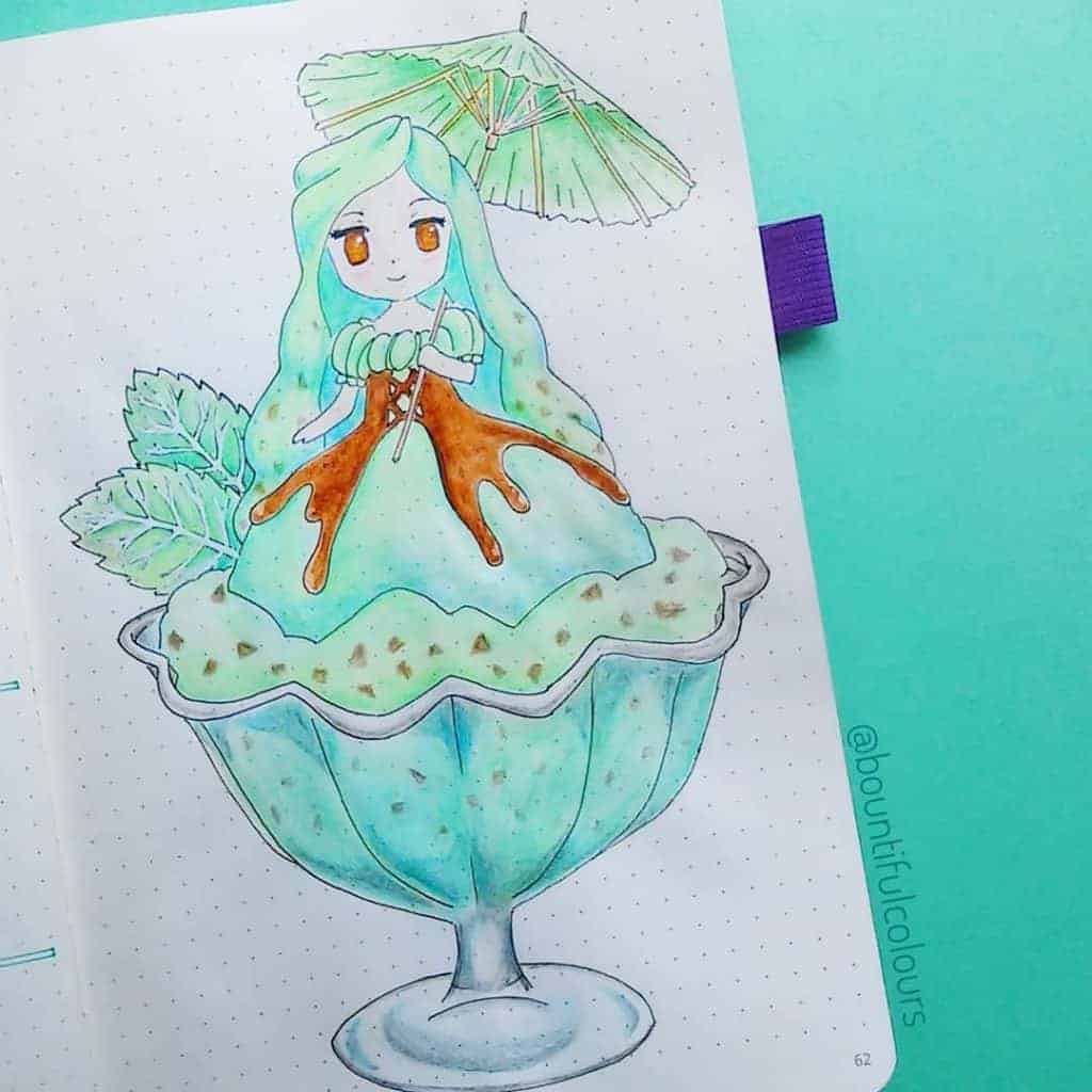
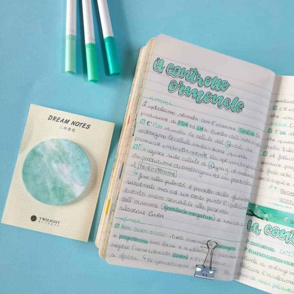
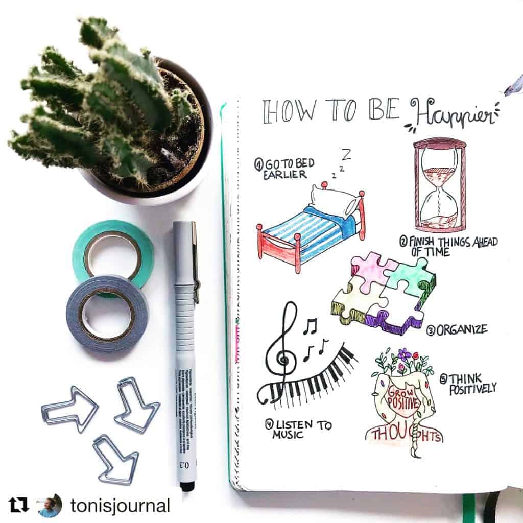
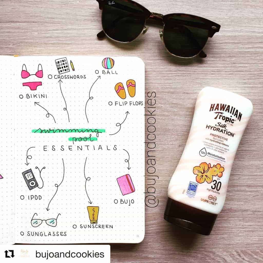
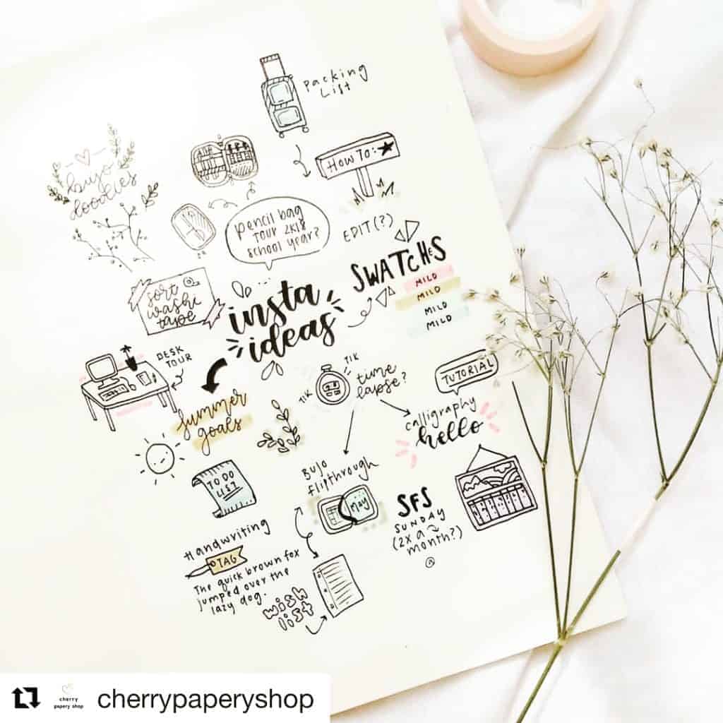
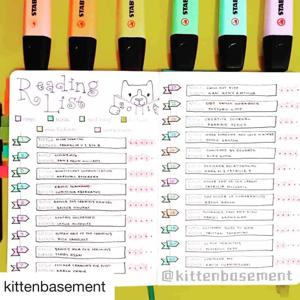
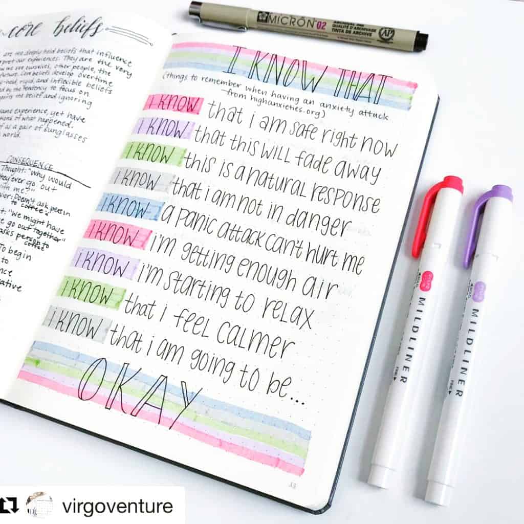
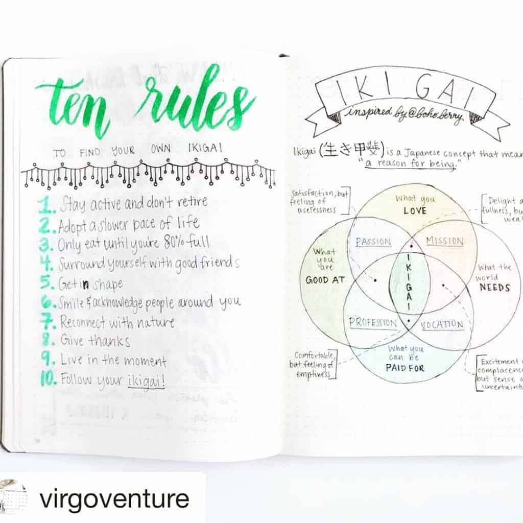
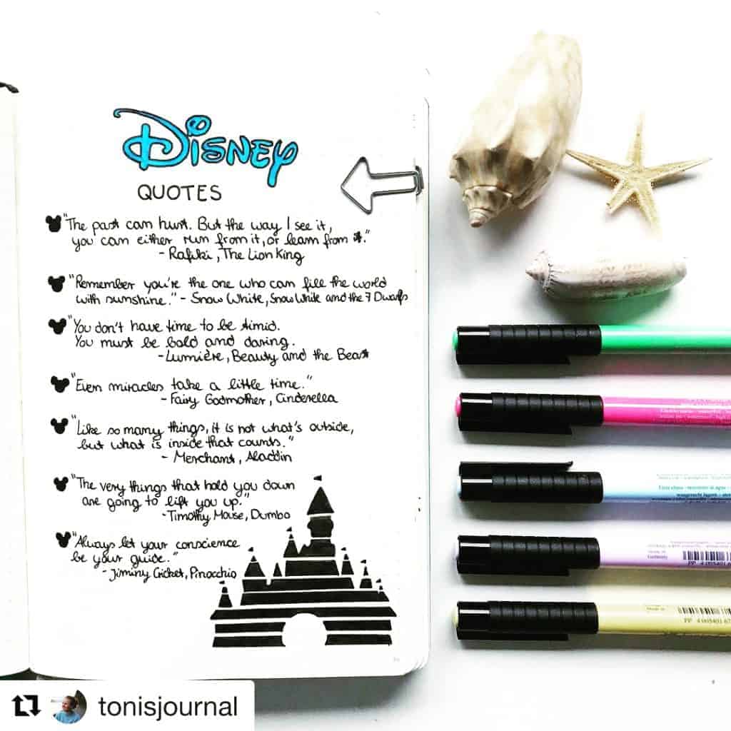

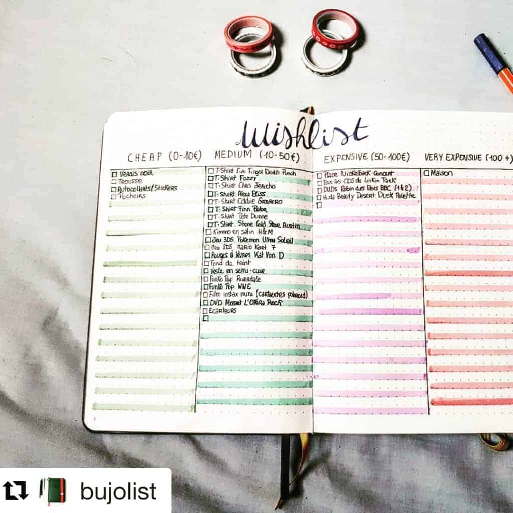
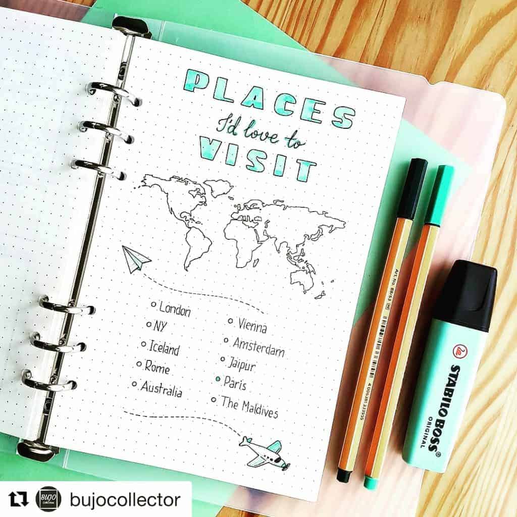
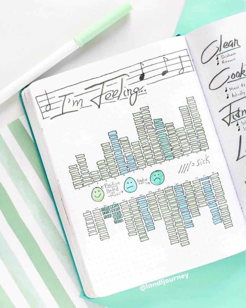
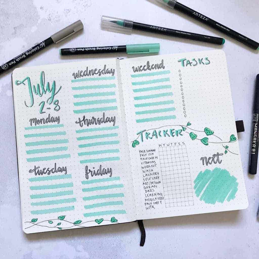
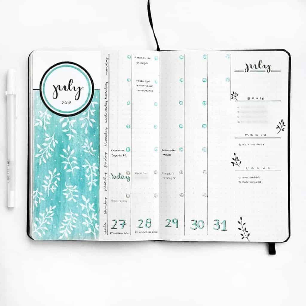
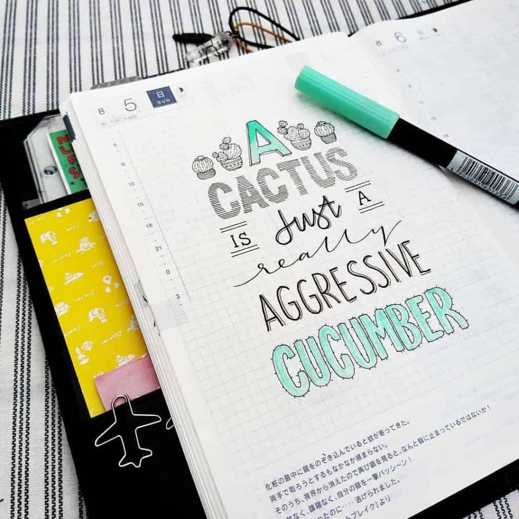
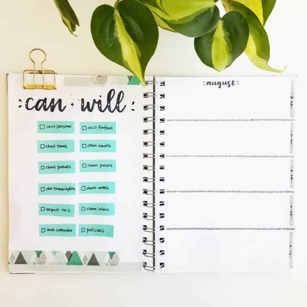
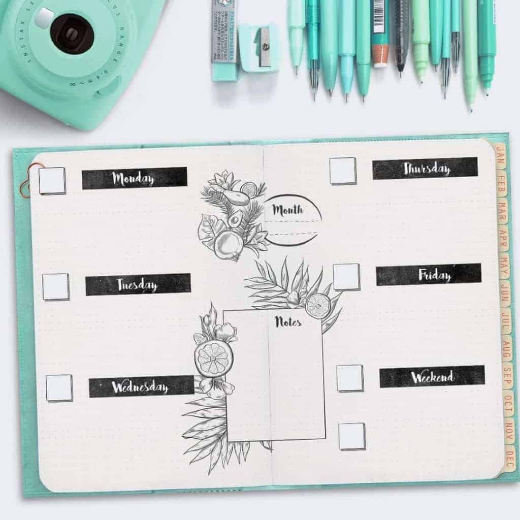
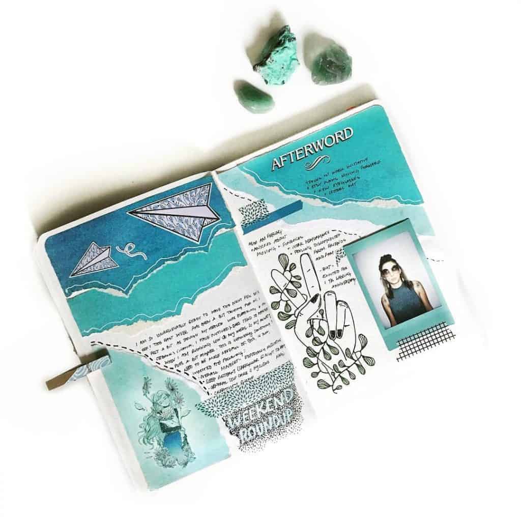
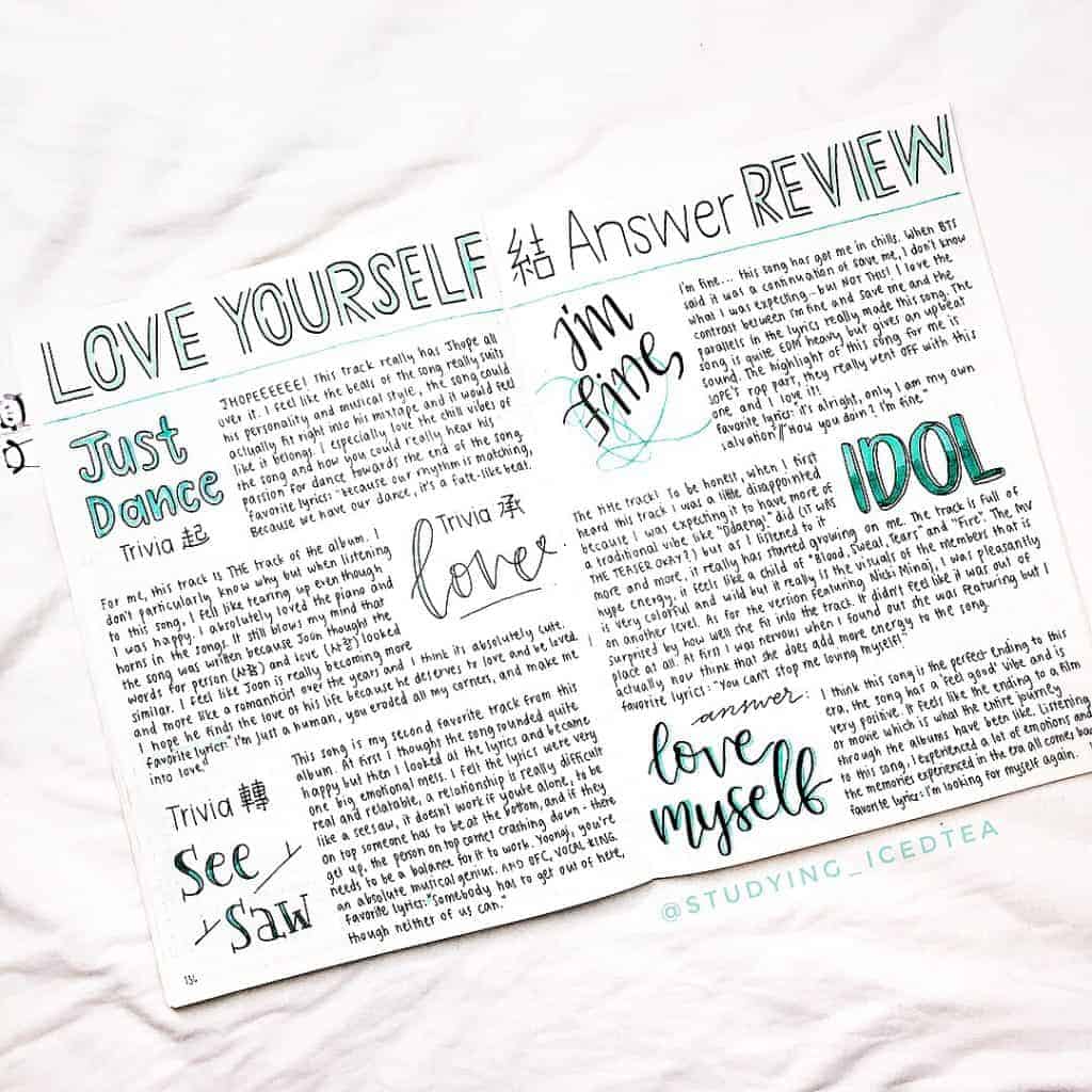
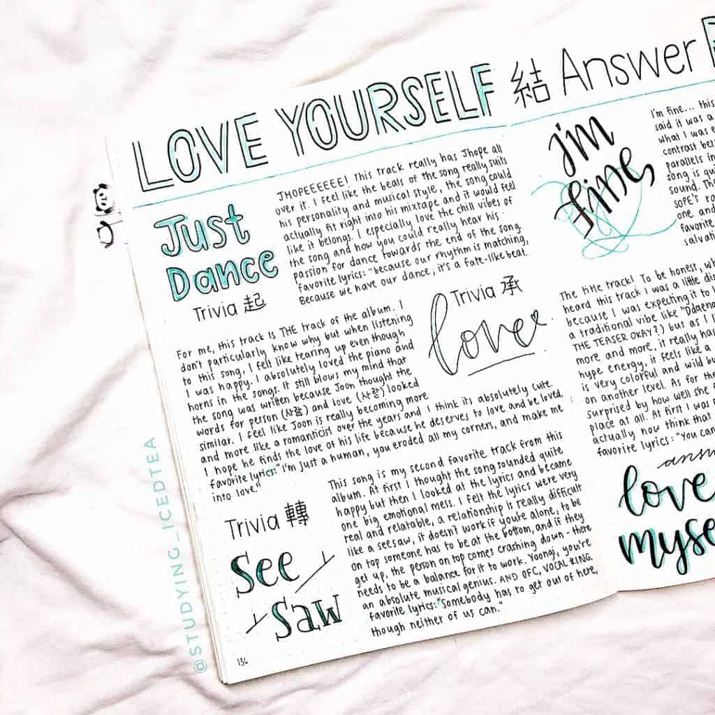
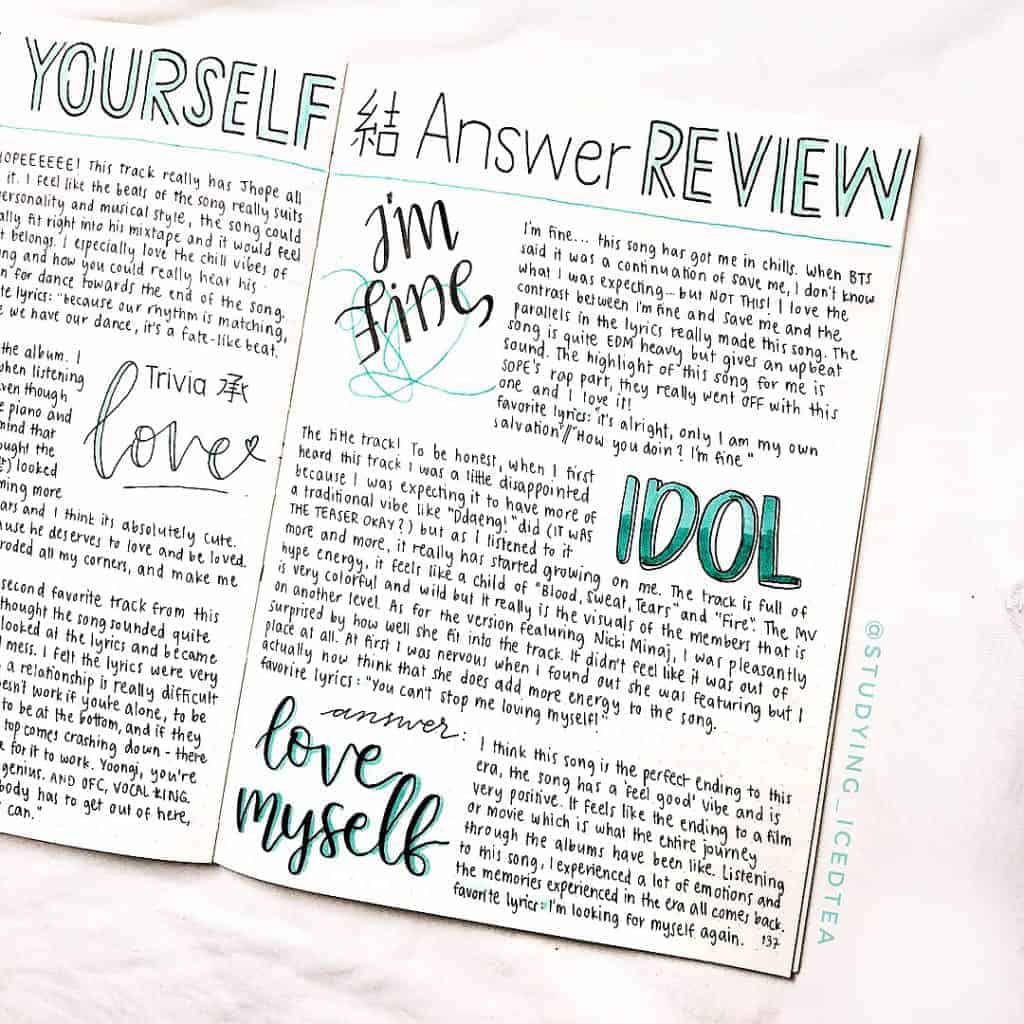
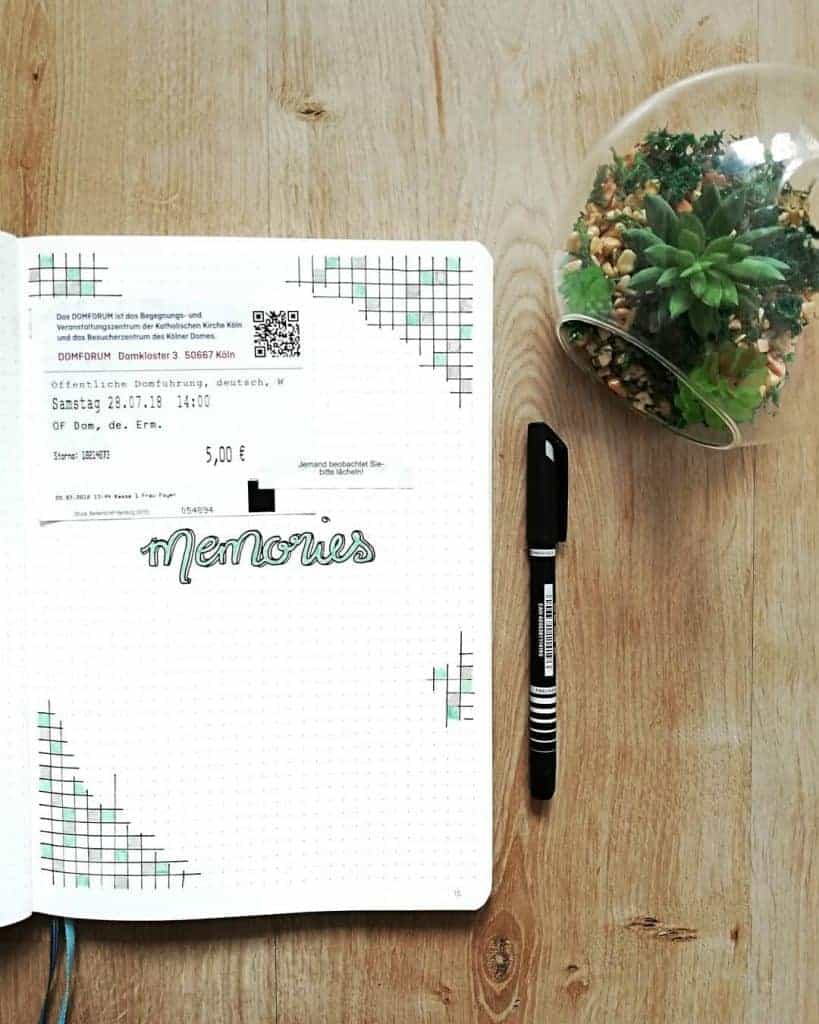
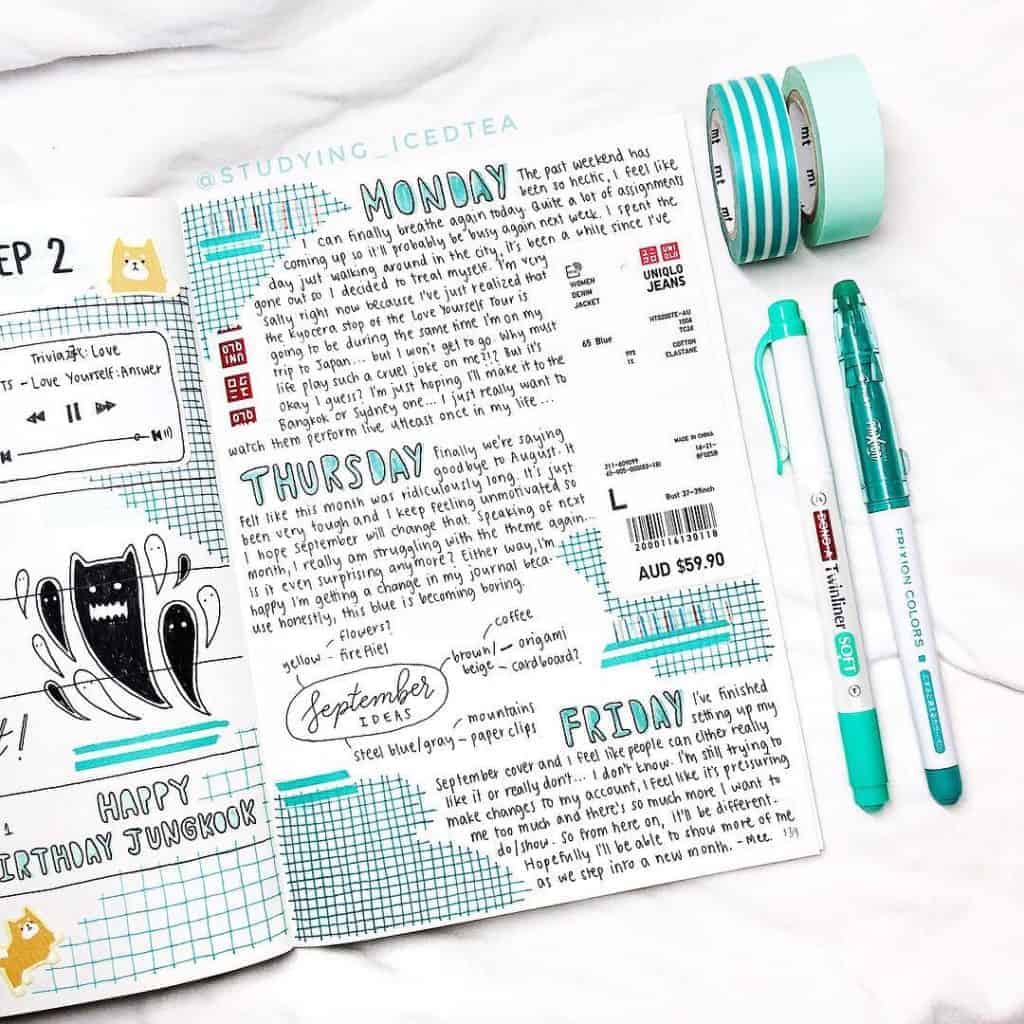
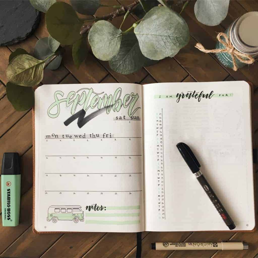
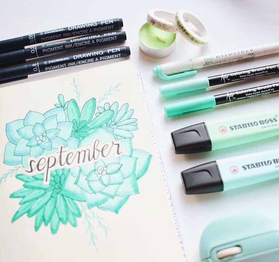
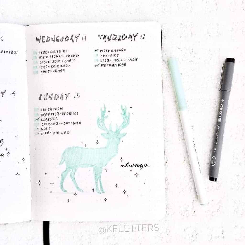
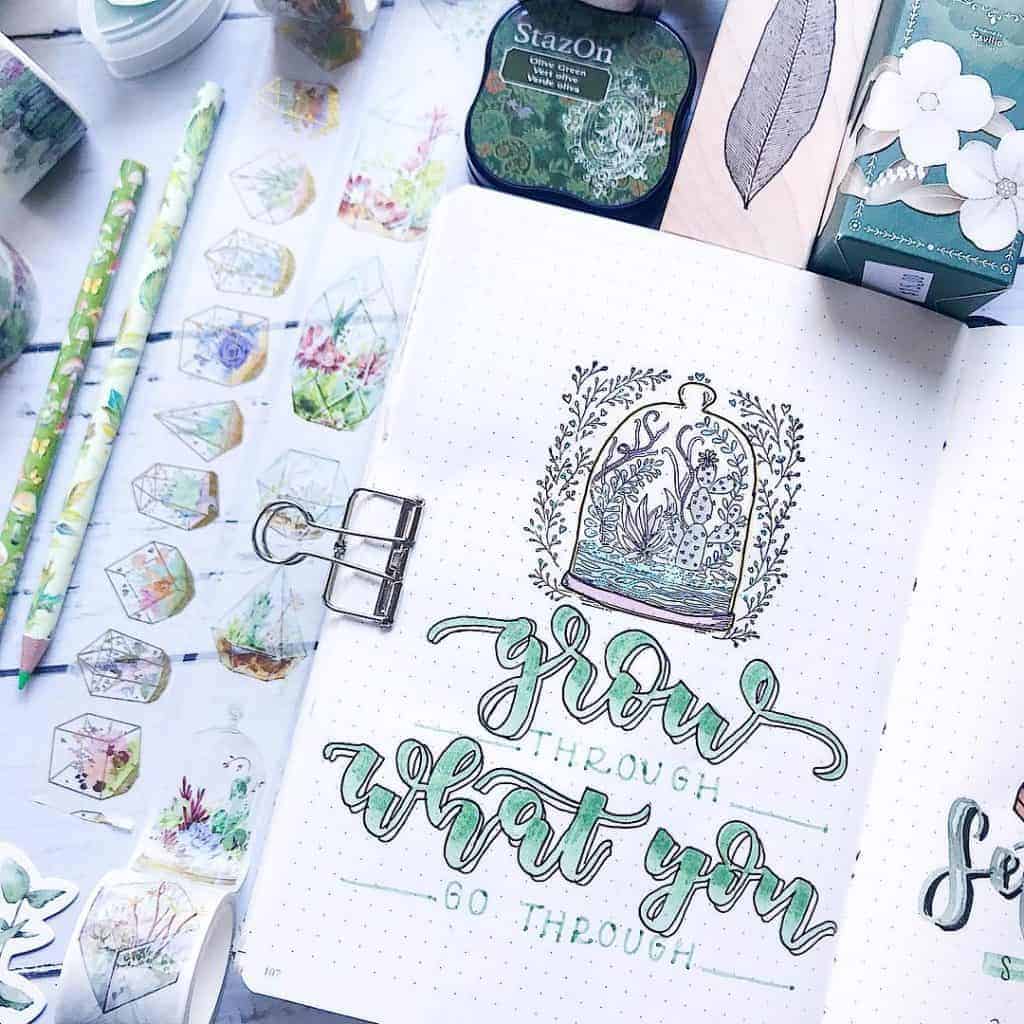
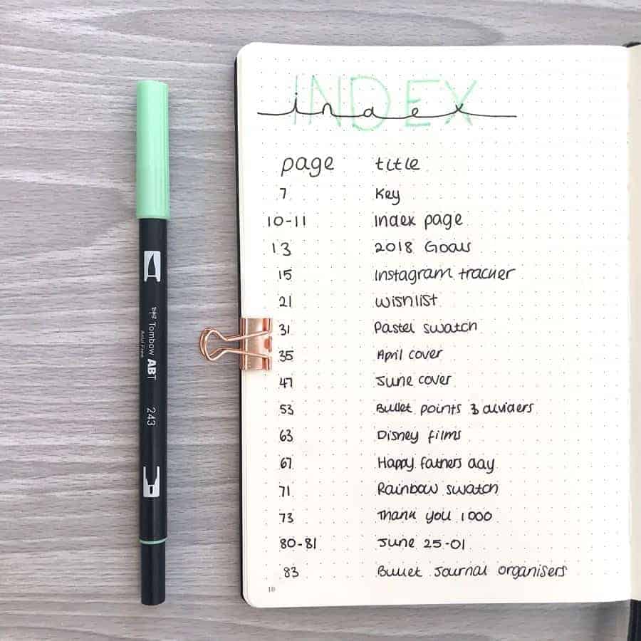
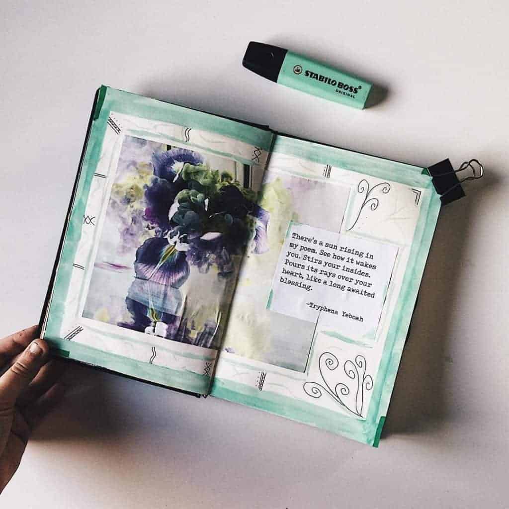
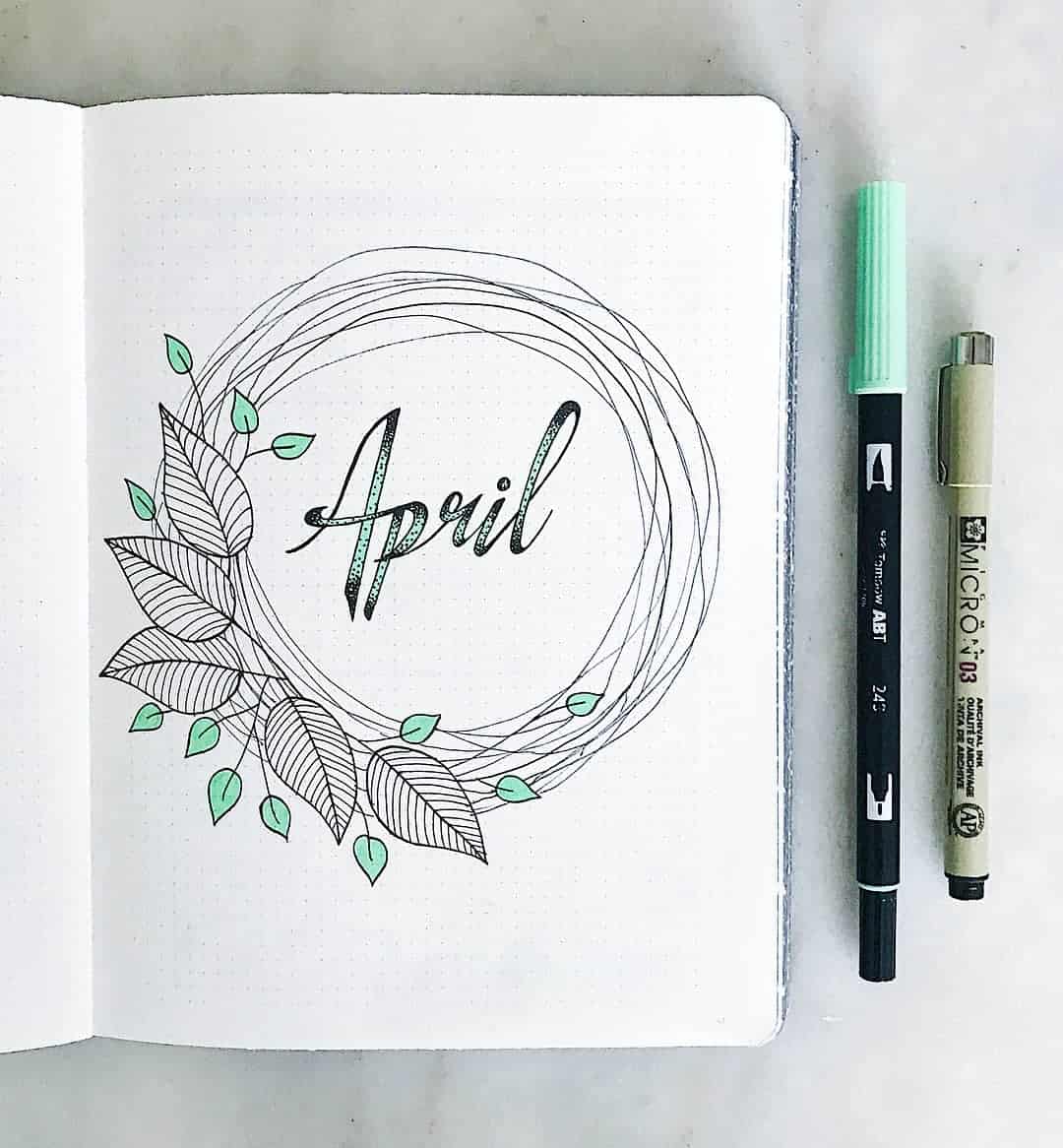
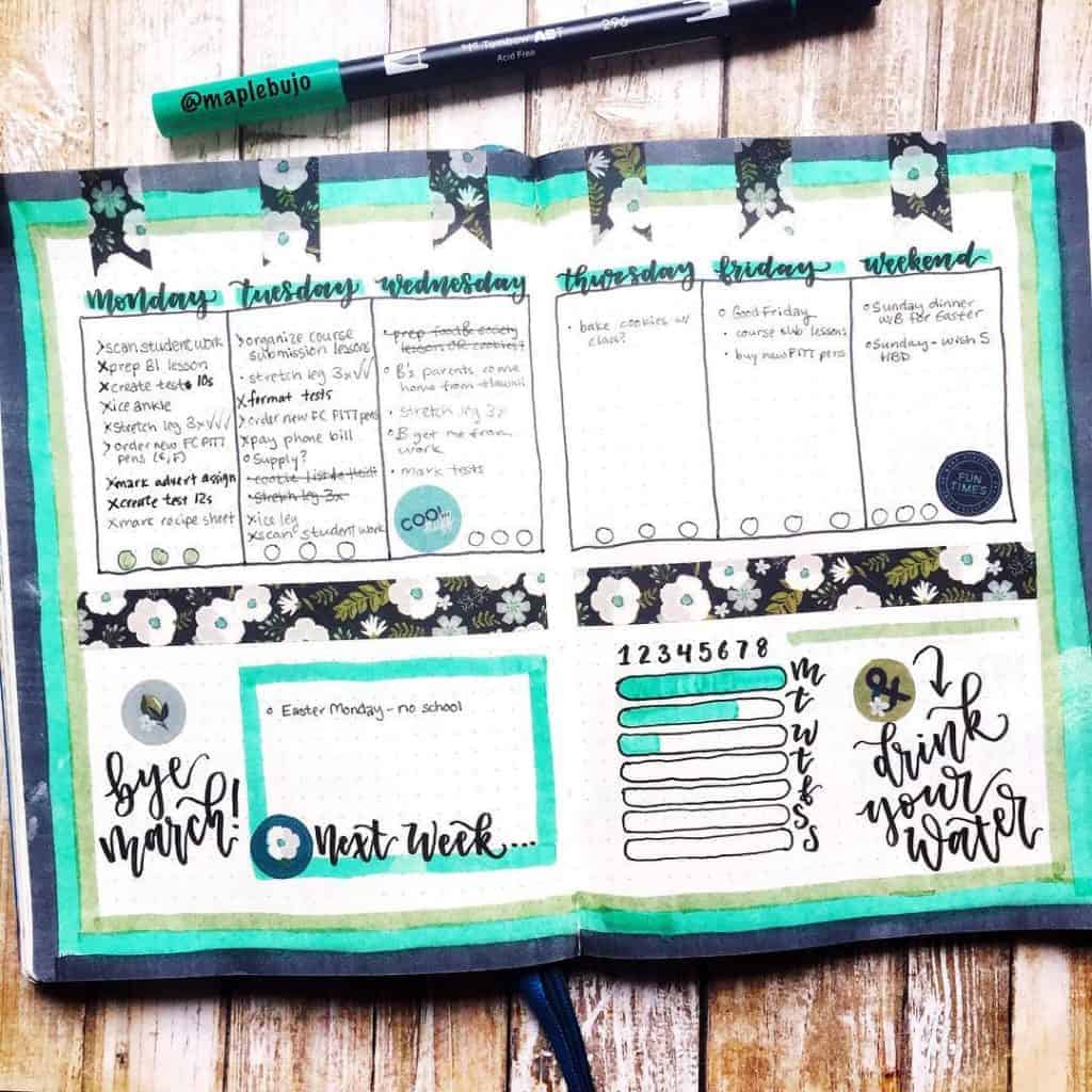
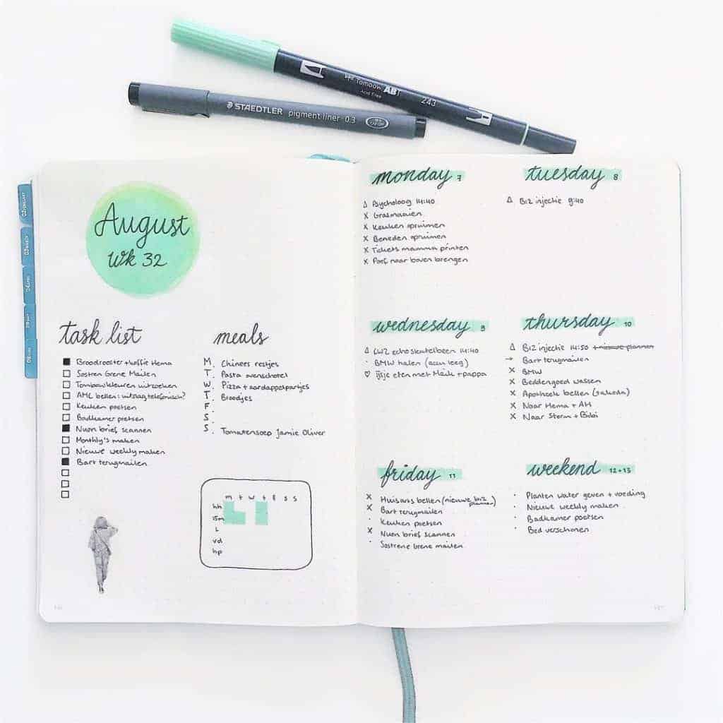
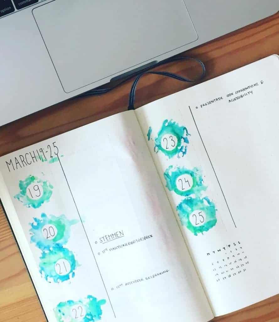
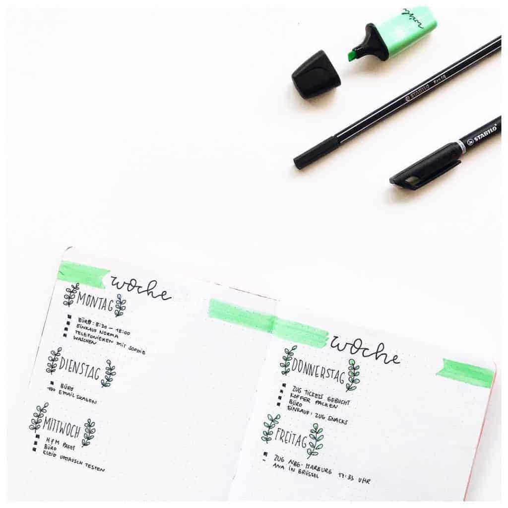
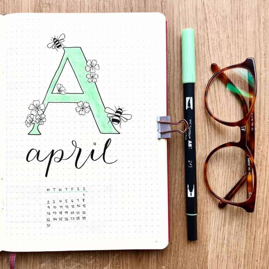
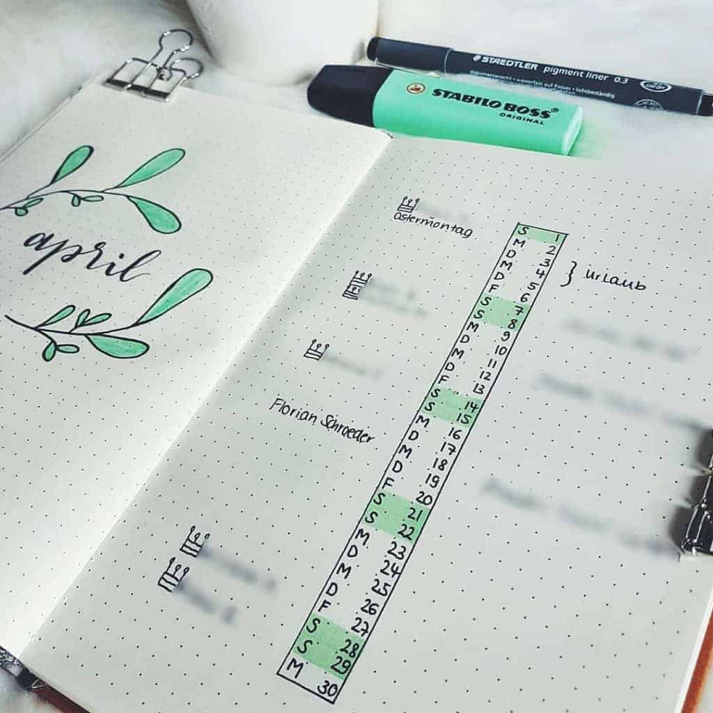
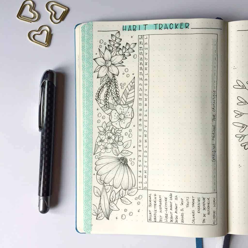
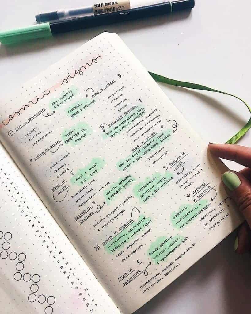
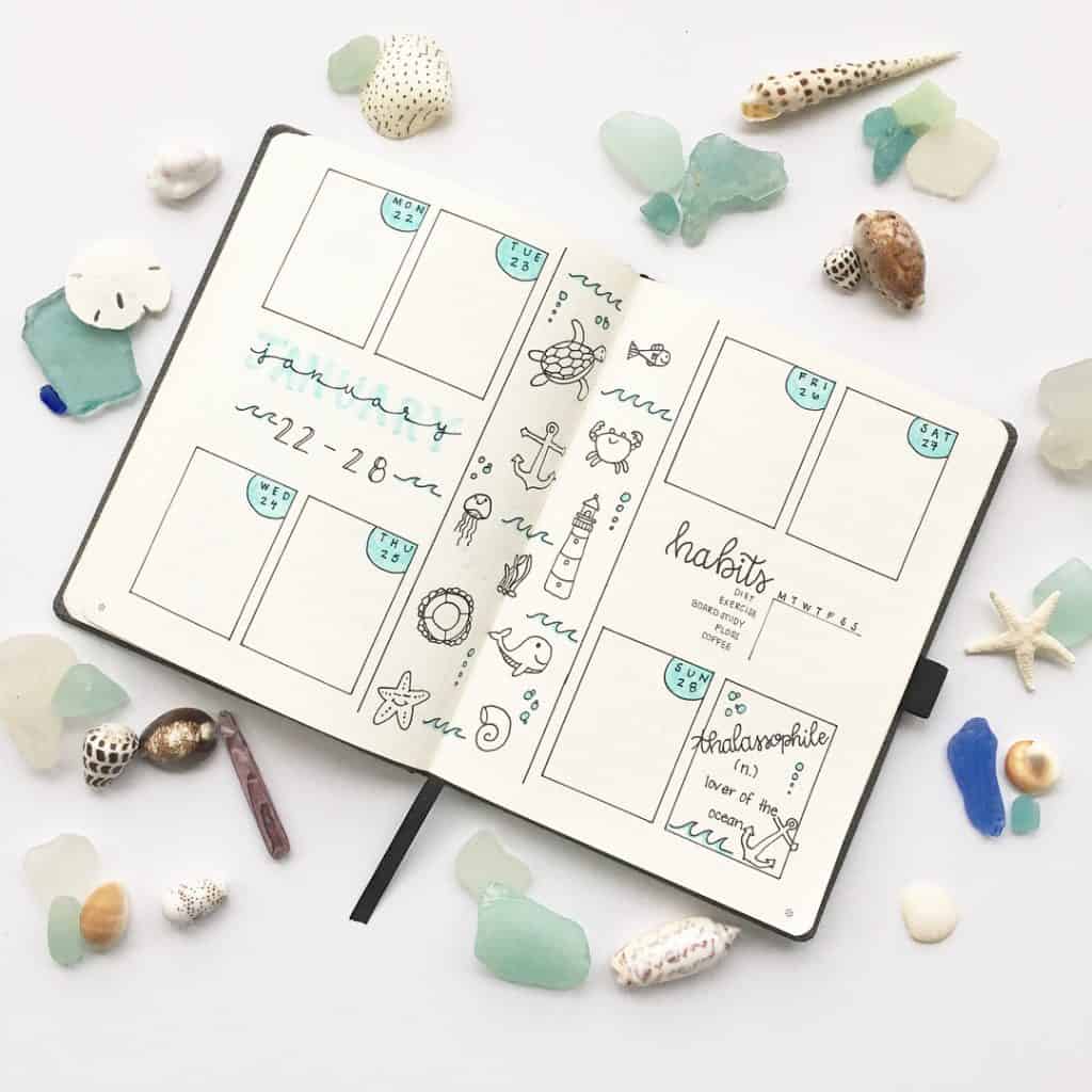
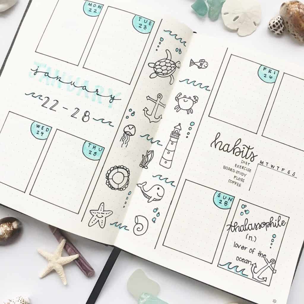
The most popular post from this week was this one from @thejournaltea with over 8k likes! What the hell!! All the heart eyes for mint bullet journal layout post!
