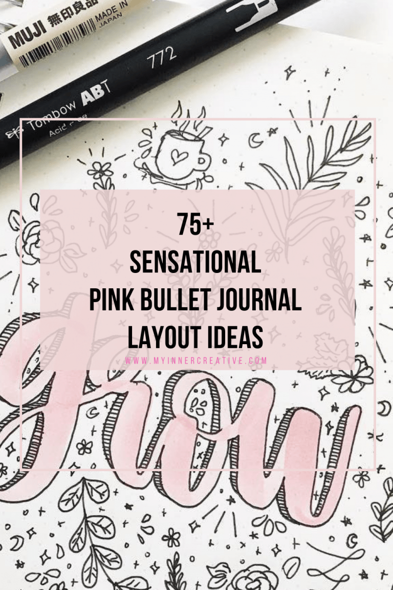
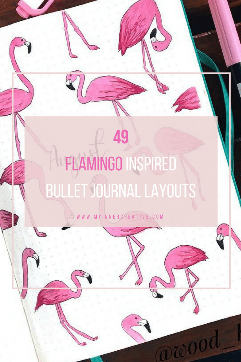
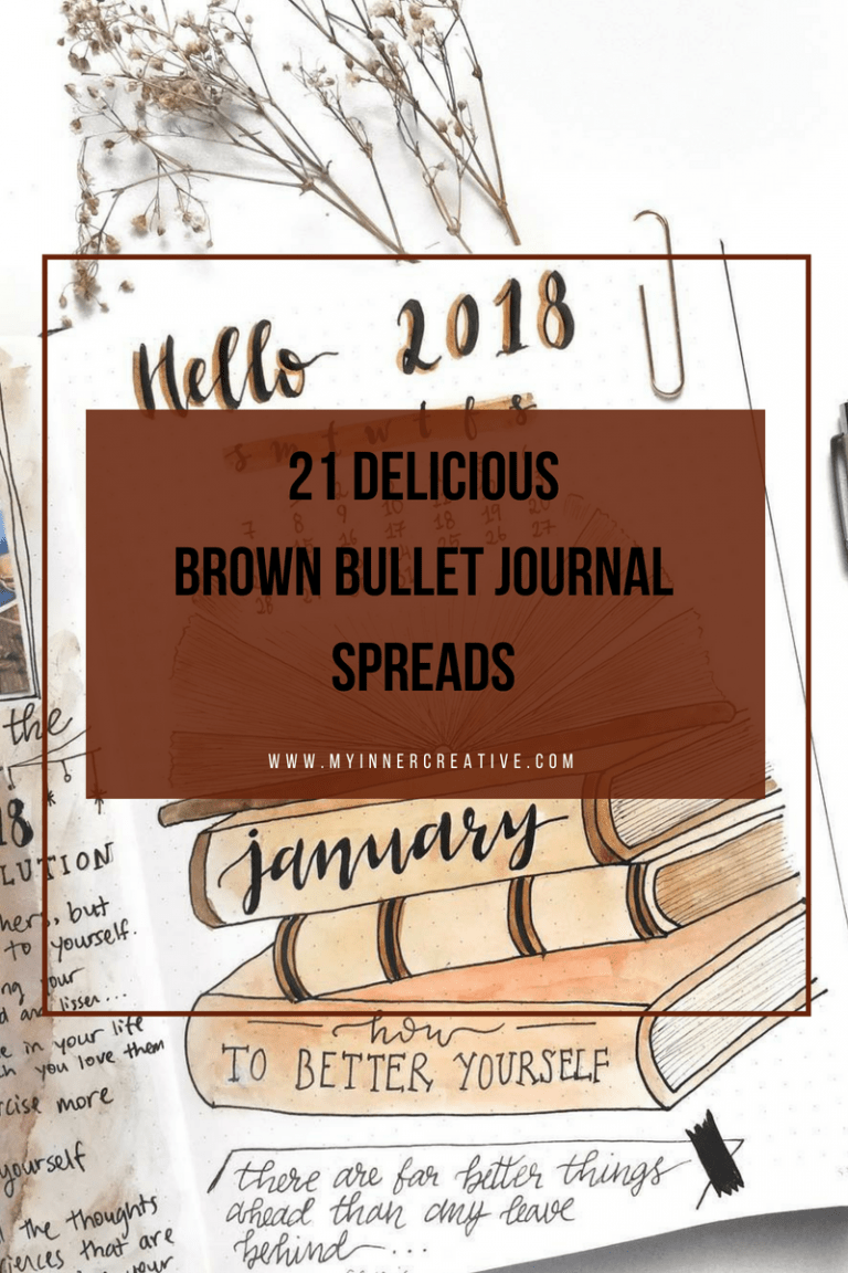
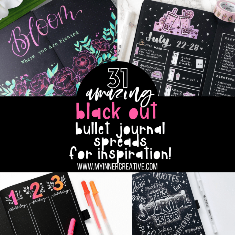
Bullet Journal Themes by Color!
LOOK FOR INSPIRATION BY COLOR
Looking for specific color themed inspiration? We have done the hard work for you, rounding up the weekly the most popular Bullet Journal Inspiration By Color! Just click on the color below to go through to the inspiration!


Lets get creative!
Inspiration comes in all shapes, and colors
We have over 1000+ inspirational bullet journal spreads and layouts in every colors you could imagine, from monochromatic to bright and colorful!
We have every single color and combination you can think of got bullet journal themes, bullet journal weekly spreads, monthly spreads and more! Inspiration for your bullet journal has never been easier to find! Need a more specific theme? Check out our massive collection of themes!

Getting started with BuJo color themes below, we cover all the colors of the rainbow, and include other colors like brown, black, gold, pastel, rainbow and more. This means if you are looking for a specific bullet journal color scheme or palette, chances are we have it!
Color coordination in bullet journal spreads serves as a powerful tool that goes beyond aesthetics, impacting both organization and emotional well-being. When we color coordinate our journal pages, we create a visual system that helps us intuitively navigate through different aspects of our lives. Each color represents a specific category, task, or emotion, providing a quick and efficient way to locate information at a glance. This method of organization reduces cognitive load, allowing us to focus more on the content and less on deciphering details.
Moreover, color has a profound impact on our emotions and mindset. Utilizing a consistent color scheme can evoke specific feelings associated with each hue. For example, calming blues and greens might be used for relaxation and self-care sections, while vibrant yellows and oranges could denote tasks that require energy and focus. This emotional connection to colors enhances our engagement with the journal, making it a more personalized and meaningful tool.
In essence, color coordination in bullet journal spreads is a harmonious fusion of practicality and creativity. It streamlines our planning, making it efficient and effective, while also allowing us to express ourselves visually and tap into the psychological power of colors. It transforms our journal from a mere task manager into a visual representation of our life’s journey, where each color tells a story, conveys an emotion, and guides us toward a balanced and organized existence.
Bullet journal color schemes and themes
Finding the perfect theme for you and your bullet journal spread can be a challenge! Its why we have tried to make this as easy as possible to find! These bullet journal ideas will have your mind running with themes and color palettes that you may not have even tried in the past!
In all our inspirational posts, we try to include some very simple bullet journal spreads to try, to make it easy for any BuJo Beginner.
We also include some amazingly artistic bullet journal spreads and themes. This is not to intimidate bullet journal beginners, it is to provide eye candy and inspiration to all.
Remember, making your bullet journal your own is critical to making the system work for you!
Why is sticking to a color theme in my bullet journal a good idea?
You might just like a particular color in your bullet journal, OR it might be that you have made the color be representative of certain months within your BuJo meaning that your weekly and monthly bullet journal spreads are all similar colors or similar theme and feel. Personally I love sticking with one theme for the month.
Bullet journal pages can be easily found when they are color coordinated and also it could be that you group collections by color too.
We have tried to capture bujo inspiration for every color available but sometimes we might have missed a color, if we have – do not be shy to pop us an email about it! (hello@myinnercreativecom.com)
Color coordination in bullet journal spreads serves as a powerful tool that goes beyond aesthetics, impacting both organization and emotional well-being. When we choose specific “bullet journal themes” for our color schemes, such as calming blues for relaxation and vibrant yellows for energy, we create a visual system that helps us intuitively navigate through different aspects of our lives. Each color represents a specific category, task, or emotion, providing a quick and efficient way to locate information at a glance. This method of organization reduces cognitive load, allowing us to focus more on the content and less on deciphering details. Moreover, “bullet journal themes” derived from color evoke specific feelings associated with each hue, enhancing our engagement with the journal and making it a more personalized and meaningful tool.
Color themes, or “bullet journal themes,” play an integral role in transforming the journal from a simple task manager into a visual representation of our life’s journey. By weaving specific color themes throughout our spreads, we create a consistent thread that connects various entries. Whether it’s the serene blues of self-care or the invigorating greens of productivity, these “bullet journal themes” become like chapters in our story, guiding us through different phases and emotions. Additionally, utilizing color themes allows us to seamlessly transition between sections dedicated to different aspects of our lives, each with its own distinctive visual identity. As we embrace the concept of “bullet journal themes,” we embrace a harmonious blend of practical organization and creative expression, creating a narrative that reflects both our responsibilities and passions.